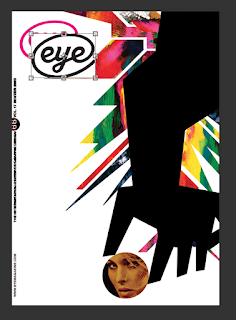
After create the mono print the other day the next step was to scan them in digital and edit them using the software, this will combine digital editing with maul print styles. Scanning in the images will give the most accurate version so they can be edited using photoshop, the benefits of being able to edit them digital is to allow me to over lap the prints, change colours without having to redo the prints, undo changes that don't work, remove print mistakes, change the size easily and photoshop filters to see the different features as it works with the exposure and light of the image that can be chained using print.The style of cover i aim aiming for is bold, bright, edgy abstract art style that reflect the current cover of the magazine, this style need to define the magazine as an art magazine and on the subject of art so the cover image needs to reflect the freeness of art and print techniques. From all the current cover it is clear that magazine is at the for front of design styles which bold colours and eye catching patterns that work to create a feel with seem to not set a feel about the magazine rather than defined as a art magazine, its genderless, emotional less but with an artistic theme and the cover need to portray this.
AIM
use the effect/benefits of photoshop to enhance the styles of the mono print
keep the texture/style of the monoprint seen
experiment with colours
overlap different monoprint to combine styles
3rd style of prints
Overlapped with 2nd test prints
Branding/detailed from covers added via photoshop
]Using photoshop to overlap a current cover then remove it when the features are correctly placed, make sure that all the cover involve the same broadening in the suitable areas for the house style
MORE EDITS
MORE EDITS
FEEDBACK
'i like the colour run more, keep them simple''don't over power the design as the texture is very heavy'
'print them on glossy paper so the colours are more vivid'
'i think the ones that use more white space work best because otherwise the effect and style of the print techniques is lost as it can be seen as clearly or focused on'
'the one with the speech bubbles seem more bolder, the bubbles seem like opinions'
'i like the lines one, especially the 3rd one 2nd from the bottom'
'the have a spacey feel, this seem to have only been created due to the natal forms used, the shapes seem very imperfect with seem more arty as it minima hand produced work'
'adding digital effect ad more layers to the images with adds depth, combining this with the unique styles of mono print create a complex cover so seem so parts more simple'
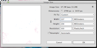
size change
After more research into eye magazine it become clear that eye magazine is slightly square ruer than A4 because of this i visited the library and measured the copy they have their then changed the document sizes to mack this cover more accurate, this can be done digitally but if this cover was completely traditionally printed i would have to have redone the design therefore this shows that digital allowed mistakes to be made in print but they can be fixed.
Digital media allow text to be alined and fit in grids, this perfect design is hard to apply using print as this techie is down by hand and eye where as this is done by accurate measurements.
feedback -
''yellow ones look like lemons'
'on the white ones you can read the eye logo better'
'pastel colours might be seen as feminine rather than genderless'
'textured approach differs from the vector style, the consumer would be more like to get this one as it seems more specialised rather than commercial'
'the second to last one seems more like the eye magazine style cover due o colour scheme and bold print but the texture give it a unique twist not seen before due to the printing method'


