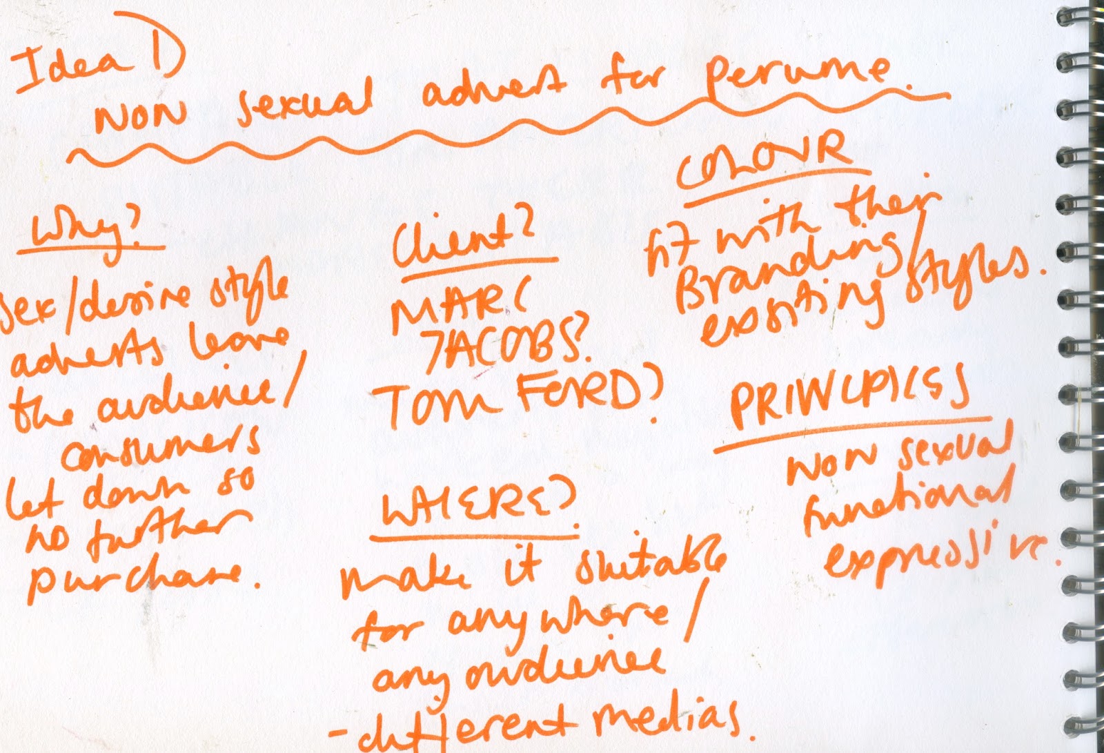
Mock Ups/ Development
aims - imply sex without using offensive or unsuitable imagery, instead use type to express sex, advertise condoms in way that expresses sexual content/tones but without offending, making a campaign that suitable for a range of audience as the sexual content is given via the interpretation rather than the subject.
content- slogans
audience - 16-24, Males, (but also females, heteromales, transgender)
client - durex
placement- bathrooms, posters, magazine, colleges
items - could be applied to posters for bars/sexual clinics, stickers, beer matts, on the condoms, on condom boxes, shown on tv after watershead
tone - friendly, playful, advice, not imitating, casual, helpful, casual
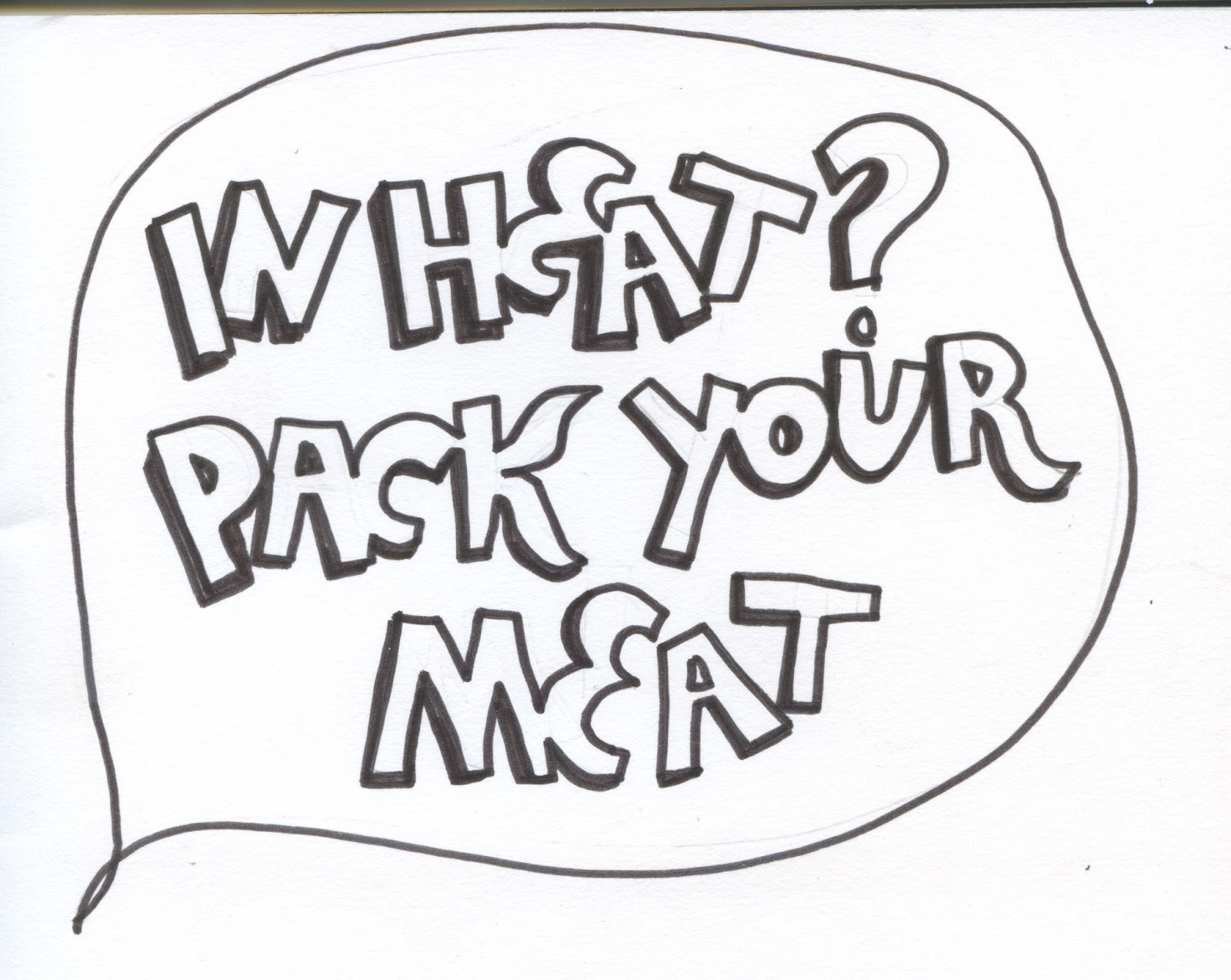
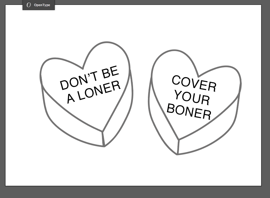
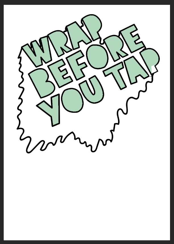
style 1)
hand drawn/expressive/handlettering type
first basic sketches -
tone of voice -
lighthearted, modern, funny, non serious, playful
The campaign style of hand drawn type also allows the client to be opener to a wider target market by removing the gendered style of advertising
the company currently
use. The current brand's current adverts aim at very masculine market which is reflected in their work via the colour scheme and harsh type style, but this style will open up the brand to a wider range gender fluid audience fitting contextual research and the with the brand ethics. The aim is not discrimate against any audeince and
reflects there openness
to gender fluid contemporary
graphic design styles. This style also reflects the research styles explored the research and the styles the distribution channels support. This style contrast the scary harsh current advertising of the brand, this in aim to reach out to wider audience whilst giving a more helpful style of promotional to an audience who might already to wary or scared to discuss sexual issues.
A hand rendered approach was developed in order to promote a friendly, approachable design to lighten the tone of the posters, fit with the humours tone of the content. The curvature present within the design appeals more towards a younger generation who have connotations to more casual, contemporary design style in which maintains tones of modernism but which isn't as harsh.
looks like advice from a friend
POSTER1
POSTER2)
IGNORED IDEA1
IGRNOED IDEA2
POSTER3)
IGNORED IDEA 4)
IGNORED IDEA 5)
IDEA 4)
IGNORED IDEA 6)
IDEA 5)
poster set -
feedback -
add colour to the backgrounds
final changes -
feedback -
cool design
seem kind, like advice
playful nature works well
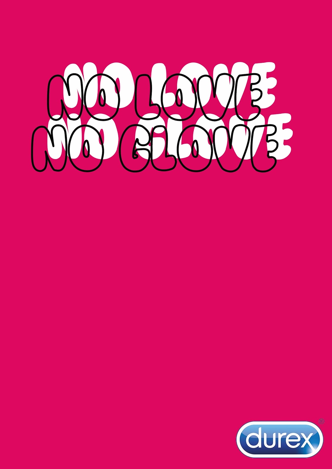
might be too pink for durex/condom market
made me laugh
could be too feminine
tone fits with the design style
style enhance content
the hand drawn aspect works well
maybe to casual?
fits with popular current illustration trends
sti/preancy are serious issue should they be more serious
perfect for the market tone
Feedback on this style was overall very positive as the target audience felt the hand drawn style fitted and enhanced contents the tone of voice in the intended form and that the hand rendered style gave the set a more personal playful touch. The feedback discusses how the content combination style felt very ‘cool’ and ‘trendy’, this fits aim of the campaign as it aims to be a campaign the audience want to share /post on social media as a form of self promotion. Feedback stated that styles visually fitted with the text content but might have set a overall too casual tone for the subject area, the use product effectively can save lives so it was felt that the poster needed to have a more serious tone to forces the audience to listen. Due to this most serious style and type has been experimented with. Also it was felt that some of the designs where too feminine for a main male product, more typically ‘masculine’ type style will be experiment due to this as not to exclude this major demographic.
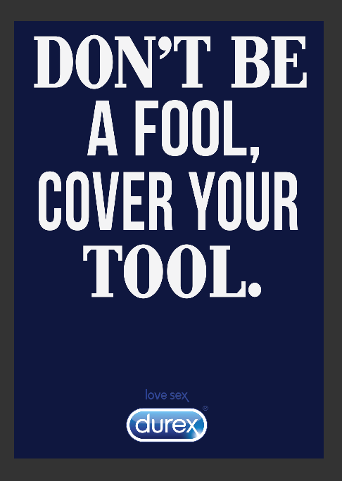
style 2)
dramatic bold strong digital type
This informative, harsher style of design was experiment with as it fits with the client currently tone more accurately, as well as the visual research in to the client current styles, fitting wit the normal style of design the client aims for. The bold type grabs the audeince attention due to high contrast masculine colours whilst setting a severe serious tone the the campaign, this link to the scare tactic currently used but juxtapositions the humours nature of the text of this idea. The style demands the audeince attention due to the use of uppercase letterforms but this commonly seen as a way of communication shouting intimated the audeince therefore in the correct way for this campaign developed. As the campaign aims set a humours lighthearted tone that is not portrayed by these poster this style was not taken forward.
tone of voice -
direct, informative, instructional,
type alining -
logo experimentation -
posters -
feedback -
too harsh for the subject area
the typography is very pleasing and looks informative
looks like war time posters, which reflect the instructions theme
funny subject yet harsh text
too demanding
loses the humour
personally i wouldn't be see it as funny
LOOKS LIKE A TOOL BOX STYLE TYPE
Feedback on the design stated that it would be seen as too instruction for the purpose, it intimated the audience rather than advised, it was seen to be similar to some war propaganda poster due to the typeface nature which bring negative connection to the campaign conflicting with the intended approach. The stern design style contradicts the playfulness and tone of the slogans, whilst also targeting the campaign due mainly at the current heterosexual male audience. This style also was seen to target a more adult audience range due to the mature style.
Mixture/ Digital Type Posters
After feedback the Antony Burril type was seen as too harsh felt as if the client was shouting at the audience which is off putting to the viewer, this is due to the slab serif style type design and bold nature of the type. Also the design was feedback as seen as not modern, as this brief aims to appeal to a modern young adult audience this needs to be changed to appear more contemporary. A few more digital typographic experiment to fit with the feedback, the aim is to make contemporary design that appeal the audience whilst reflecting the modern theme and allowing the context to express the content.
After feedback the Antony Burril type was seen as too harsh and the hand type was seen as to casual a more contemporary digital modern design style of typography was experimented with. This campaign style removes the colour too feminine pallete which the audience had issues with with the first idea whilst using a more playful colour palette that the second ideas which was seen as too drastic and serve. A few more digital typographic experiment to fit with the feedback, a balance between the two existing styles as both received drastically contrasting feedback. The colour palette was kept bright to be eye-catching yet changed from pastel in order to appeal to a more masculine audeince range. The main typography was changed to digital created type instead of hand rendered to fit with this more masculine themes. Some decrotive and some simple modernist typeface have been used to create a poster series that appeal as a range to a wider gendered and sexual diverse market.
idea1)
idea 2)
idea 3)
idea 4)
idea 5)
final set -
feedback
lost the stand out nature
seem too much like the current adverts/every other type poster
the humour is still lost due to the digital type
more casual that the last ones but still kinda formal for the audeince
i prefer the first ones
still give of a demanding informative nature
not noticeable
good medium between the idea
Feedback -
After feedback on this style of design the over arching comment where about how not the design has lost it’s unique nature, this current poster set had become very main steam and is seen commonly which would causes the poster to be lost in the mass of advertising poster and leaflets the market is exposed too. The digital type was again seen as too serve to reflect the humours nature, without heavy focus on the content the tone of the message is lost.
After feedback on the different forms of the ideas as a collective it was concluded the style that needed to be developed more was the first idea. This is as most of the group agreed that this was the most appealing, versatile design that they’d pay attention to in location. The design was felt the most suitable as reflected a more lighthearted, warm tone which fitted most effective with the content tone. The more casual style created a campaign that felt more like advice that demanding, which fits with the principle of not wanting to scare the audience out of sex as a whole.