Sunday 26 March 2017

COP2 PRACTICAL - Study Task 09 - Outcomes

Final Evaluation 

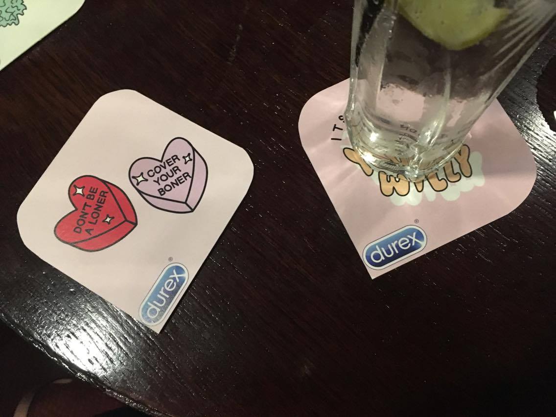
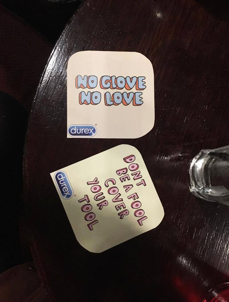
Throughout this project tone of voice has major theme and issue, the research highlight that if sex is used to make it appropriate it must be used in tone that’s positive, if not this a defining feature that cases audeince complains and negative feedback. The current advertisement for the client have humorous or sexually tone but this is undermined by the scare of pregnancy or sexual infection or even sexual disappointment. This brief aimed to promote to a low sexually uneducated audeince as it’s the audience that is in need of the product the most but due to their low age finding the correct tone for the campaign was difficult. The tone that needed to be portray was informative advice yet also humours and sexual, in the correct balance as not to scare the audience of sexual activity totally. The final tone expressed via the hand rendered style expresses a tone which demographic feedback agreed fulfils the intended aims, as to be functional yet communicate with the audeince on a level they can identify with and productive in no encouraging sexual actively but encoring them. The tone is supportive yet not threatening or severe but allows the sexual content and humour of the content be expresses accurately.

The final colour palette of the campaign uses colours which take inspiration for style research and current trends but also represents the theme of sex in association with the themes of love suggested by the pale pink and romance colour scheme. This allowed sexual theme to be associated without the vulgar undertones but rather presented in a soft caring manner. 

Demographic market of the product and client has influenced the final outcomes of this brief extensively, contextual research into which audeince suffered for lack product use made this the main market to appeal to which effect the final outcome drastically. As the campaign doesn’t feature any threats of STI or of pregnancy it’s effective promotion all sexualise that would use the product. As not to offend and to wider the the audeince range the outcome kept to sexually and gender neutral themes, this has benefited the final outcome by not displaying any visual to lounge preference to any sexual orientation this give set a supportive tone to the wider market as well as set the company as very socially aware.

The campaign has been successful applied to a range of different channels and mediums, this shows the versatile of the campaign style and also the future application of the campaign. The campaign expresses sexual content in a way that most audeince wouldn’t find offensive due to the lack of imagery and humours overtones. The final outcomes fits the ideals set by the brief as it uses sex to a level that appropriate to the selected audience but also to a wider indirect audeince without causing offensive/insult. 

Location is a  major feature in the success of this campaign, it has been analyse so the brand is not seen to be promoting it’s self and sexual activity to an underage audeince. The brand it’s self is associated with the promotion of safe sex but still the promotion of sex therefore make sure sex is not adverting to under the legal age shows the brands ethical concerns. Although the brand doesn’t aim to promote sex generally to the younger audience (under 16) this campaign has be designed to target a newly sexual active audeince, this is to inform about safe sex at the younger age and due to the high STI and abortion rate of this age group.

Even thought feedback sated the final campaign isn’t seen visually as to feminine in my opinion parts of the campaign favour feminine design styles due to colour or style, a wider range of more ‘grunge’ designs could be created in this style to appeal to the masculine male audience more. 


In conclusion the removable of sexual imagery has created a campaign that uses sex in a way that is more widely excepted and suitable for the younger audience, the campaign has removed any pedophilic implications or exploitational themes but managed to appeal to a audeince of this age. The use of sex and the sexual content has enhanced the design as it’s allowed the audience to pay more attention and be more intrigued by the campaign in the correct way, sex has been used to an appropriate level. 

Wednesday 8 March 2017

COP2 PRACTICAL- Idea 3, Feedback /Patch/sticker Mockup

Feedback

After development of this project and the final images of the campaign is use where taken final feedback was asked for in a group, this was to see if there was anything that could be done o the brief, any small changed that could  made before the deadline or to highlight any issues with the outcome.


Iron on Patches -

One of the visual style influence was iron on/stew on patch design, this is as iron graphic type patches are a popular current trend use by many different brands like Zara Topshop ect who target the intended market of this campaign audeince. This style of illustrative design is currently popular with the target market, using this style as a way to appeal to they will create an item that appeal to them but also could create a piece the audeince would like to collect or wear therefore this mean the design could be appeal to actual patches. The style is designed around this trend aesthetic to so using it as a medium of communication could be another distribution channel. Applying the brand to current trends give the impression the brand is the relevant and 'cool', this is important to the traget market as they will care about keep up impression and appearing cool to their peers. It also allowed the audeince it's self to promote the brand via applying it to their clothes, which will display the campaign to a wider network. These could be given away for free in fresher pack, at sexual clinics, at college/uni the same as the stickers.


 Car Stickers

The target audeince age range is the age in the uk that people can start driving lessons and can drive therefore a large percentage of the target audience will own their own car or drive a car. Stickers are often used as a way to personalize car, especially for the more less serious part of the target market therefor applying the campaign to this medium and distributing this at the same channels will increase awareness as well as use the audience to self promote.


primary research


mock ups-


SOCIAL MEDIA

As the audeince has grown up as part of the 'Internet generation' and is described as social active, social media is a wide platform the target audience will use heavily therefore this campaign need to be able to be applied to the brands media pages. This is another channel the brand can use to target this market directly, Instagram was selected as the media site as the brand already runs a active account to connect with customers and also as users have to be over the age of 14 therefore make sure sex is not promoted to underage users.


Friday 3 March 2017

COP2 PRACTICAL- Idea 3, Location/Development


Location/Development

After selecting idea 3 as the main idea to take forward for this brief outcome, the posters themselves needed more development to become a full advertising campaign. Most advertising campaign take the form of  a range of different mediums - TV adds, billboards, magazine adverts, posters, social media adverts, leaflets ect, the suitable one for this brief will be explored.

One of the main feature of a good advertising campaign is that it can be applied across a range of media, the campaign should be versatile so the client can use it in their advertising. The final outcome should work as other item more than just a poster, theses designs will therefore be applied to a range of different medium in different way to test if this campaign can achieve this.
The essay discussed and concluded that of the factors that defines if an advertising campaign uses sex appropriately is where and how the adverts are placed, the audience of the adverts needs to be suitable and be of a expectable age/beliefs, if not the adverts can be seen as unsuitable hence receiving complaints. This campaign will need to fit within these rules, even thought the sexual content of the design is relevantly low there is still sexual language and innuendos used some view would find offence to young children. Also the client as being condom would offend selected religious so these should be avoided is possible.

To make sure the campaign is only seen by a suitable audience it will be primary promoted in area/places where the audience is sexual active, in the UK this is around 15/16, and research into the STi in the uk showed  'In 2015, there were approximately 435,000 diagnoses of sexually transmitted infections (STIs) made in England The impact of STIs remains greatest in young heterosexuals under the age of 25 years and in men who have sex with men (MSM)' so the loaction show be places under 25 visit to targt this audeince range. The  locations aim to be areas where consumers over the age of 16 visit/see, this is as this is leal age to have sex in the uk. This therefore outlines Billboards, selected tv times before the watershed, most magazine/newspapers, most social media sites and leaflets as these would likely be seen by a wider audience of all ages.

The placement needs to be specialized so it's only for audience over the age of 15/18 to 25, 18 is the legal drinking age in the uk therefore only people of this age or older are allowed into  as well as this target market being very socially active means nightclubs, bars/pub therefore this market will be advertised too in these locations. This is also the perfect market for this campaign as people of the target audience age are found most in these places, this means finding way to adverts the design in these areas would be suitable. The ideas for this is to create beermatts, poster for the toilets/area, and sticker for the back of toilet doors. Colleges, sixth-forms, universities, and adult magazine will also be a place the adverts could be placed, as these again will also be place only over 16 can view the adverts. Tv adverts could be done but these would have to after the watershed only.

BATHROOMS - at clubs/bars the condom machines are usually located in the bathrooms therefore placing the sticker as a reminder in these places will encourage the consumer to purchase.The advertising placement next to the distribution channel reminds the audeince which brand to pick at the needed moment, whilst also reminding them to purchase the condom when they are around the item/ when the item is assessable


beermatts- 
size of average beermats - 94mm
-creates talking point at tables,
-is in the audience view line when drinking
-used by audience so bought to attention
-bright colour scheme will stand out against tables


Sticker development -
This will be placed in different located but mostly on the back of toilet doors/cubical or next to the condom machines, or around the sinks/mirrors. Size 10.5 by 7 cm, small yet big enough to read and be legible
-stand out against the background
-more intriguing that posters
-can be applied to any surface
-advice is generally give on the back of cubical doors, link to this
-will be audience focus point in this situation

issues- see thought background or not???


printed -

beermatts-


stickers -


first print, wrong size too small, logo unreadble

size comparison


photo in placement -
Too see how the piece look in use the campaign was taken down to a local bar, this bar doesn't allow in anyone under the age of 16 and has bodyguard checking ID on the door. As no one under the age of 16 is allowed in it make sure the campaign will target the intent audience only, this will make the campaign fit within the guidelines set by the essay, its achieve the selected purpose of only appealing to and targeting people over the age of 16.

location -
brudell social club leeds  (raw files)


photos tested outside but due to lighting where ignored


location - 
Leeds College of Art


FINAL PHOTOGRAPHYS
The best location shots have been edited and collected togetehr for the final project imager, these are the picture where the design and style can be reflect in placement and seen to the best ability. These are the photo that will be included on these design boards, sent to the client, and uploaded to behance.